


In retail, everything revolves around experience and trust. Customers need to feel within a few seconds: this is a pleasant store, everything feels right here. Light is a silent salesperson in this respect. Not only because it makes everything visible, but especially because it determines how products look, how fresh or luxurious a store feels, and how long people continue browsing.
Yet light colour is still often underestimated. We regularly see stores with perfectly good fixtures, but a light colour that is just slightly off. A clothing rack that looks flat, bread that appears less warm than it really is, fish that does not look fresh, or a high-end store that unintentionally feels cold. The good news is that this can be solved effectively, as long as you make choices based on function and product rather than habit.
In this blog, we explain how to use light colour (Kelvin) intelligently in retail, how CRI (colour rendering) determines your product presentation, and how a simple combination of ambient and accent lighting can strengthen your store.
Light colour in brief: what does Kelvin mean?
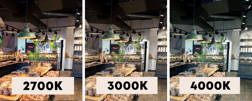
We express the colour temperature of light in Kelvin (K). Put simply, this is the tint of white light. The lower the Kelvin value, the warmer and more atmospheric the light. The higher the Kelvin value, the fresher and more functional the appearance.
- 2700K is warm and atmospheric (homely, inviting).
- 3000K is warm white and often the best all-round choice for stores.
- 4000K is more neutral and fresher (bright, clean and functional).
- 5000K and higher moves towards daylight and is mainly intended for specific applications.
It is important to know that LED is not automatically cold or harsh. That was more often the case in the past because there was less choice. Today, LED allows you to create very warm and comfortable light, or a clean and fresh atmosphere—exactly what suits your store.
Why the right light colour has a direct impact on shopping
Retail lighting is about more than providing sufficient light. With the right lighting setup, you can influence atmosphere, focus and product experience. This affects how long people stay, what they notice first and how confident they feel about their purchase.
In practice, colour temperature and colour rendering (CRI) work together to determine whether a store feels professional and attractive. That is exactly why we always consider lighting from the perspective of its purpose: what experience do you want to create, and which products do you want to make stand out?
Starting point: what impression do you want to create?
Before looking at exact Kelvin values, we always start by considering the store concept. Your lighting should support the brand experience. A luxury store often works best with a warm base and strong accents. A cosy store calls for warmer tones and soft transitions. A discount retailer, on the other hand, will more often choose a fresher, brighter base to create a clean and efficient appearance.
There is no right or wrong concept. What matters is that the lighting matches the identity of the store and gives customers the feeling that everything is just right.
Which Kelvin value works best in retail?
2700K: warm, atmospheric, premium
We often use 2700K when atmosphere and experience are the priorities. The light feels homely and friendly and can give products a more luxurious appearance. This is a strong choice for boutiques, interior stores and concept stores, especially when combined with good accent lighting.
3000K: the retail classic
If there is one colour temperature we recommend most often for stores, it is 3000K. It is warm enough to feel pleasant, but bright enough to present products effectively. 3000K also works very well in window displays because it is inviting without becoming yellow.
4000K: fresh, functional, clean
4000K is well suited to environments where freshness, hygiene and visibility are important. Think of supermarkets, pharmacies, workspaces or stores aiming for a modern, clean character. In showrooms and some retail concepts, 4000K can also help present products with exceptional clarity and definition.
5000K and higher: niche applications
This is mainly useful when you want a daylight-like assessment or in very specific situations. In most stores, it feels too cool for a pleasant shopping experience.
CRI: the hidden factor that makes your products look better

Kelvin determines the tint of the light, while CRI (Colour Rendering Index) determines how naturally colours are reproduced. In retail, this is often the difference between lighting that is merely adequate and lighting that makes you think: wow, that looks great.
In many stores, we recommend CRI > 90 for fashion, interiors, cosmetics and anything where colour perception is important. Even higher values, around CRI 95-98, are interesting when colour accuracy is central, such as in art, galleries or premium presentations.
A practical example: with a CRI that is too low, a red shirt may look slightly different in the store than it does outside. This may seem minor, but it affects trust and can increase returns.
Product-specific lighting: why some stores benefit even more from tailored light sources
Not every store sells the same types of products. Therefore, not every store requires the same light distribution or spectrum. In practice, we see that some product groups respond particularly well to lighting that is adjusted slightly differently.
Think of bakery products that look warmer and fresher under the right light, meat that takes on a richer colour, or fish for which a fresh appearance is essential. Higher colour consistency can also make a major difference for art and antiques. In fashion, a good CRI and consistency between fixtures are important for presenting colours reliably.
This does not mean that you always need special light sources. However, in stores where presentation drives sales, deliberately choosing product accent lighting can offer a clear advantage.
Our approach: ambient lighting, accent lighting and window-display lighting
In retail, we almost always work with a combination of layers because one type of lighting rarely does everything well. Ambient lighting ensures that the store is pleasantly and evenly lit. Accent lighting, often using track spots, focuses attention on products, displays and walls. Window-display lighting attracts attention from outside and determines the first impression.
It is precisely this combination that creates a store where everything feels right: bright enough for comfortable shopping, but with sufficient contrast and focus to make products stand out. For high-end retail, we often deliberately choose track lighting because it is flexible. You can reposition spots for new collections, seasonal changes or alterations to the customer flow without having to carry out new building or drilling work.
Common mistakes we encounter in stores
A store can be technically well lit and still sell less effectively because of choices that unintentionally work against it. These are situations we often see in practice:
- One colour temperature used for everything, resulting in no focus or atmosphere.
- Light that is too cool in a store that should feel warm and luxurious.
- CRI that is too low, making colours look less attractive or inaccurate.
- Too little accent lighting on walls and displays, leaving products looking flat.
- A window display without a proper lighting structure, even though it is a powerful opportunity to draw visitors inside.
The good news is that this can usually be resolved without replacing everything. A targeted adjustment to the light colour, CRI or spotlight positioning can already make a significant difference.
Need advice for your store or project?
The best light colour depends on your store type and desired appearance, the products you sell, ceiling height and layout, incoming daylight and, of course, your budget. We regularly create lighting advice and lighting plans for stores and installers. We look not only at providing sufficient light, but also at how lighting contributes to presentation, customer flow and sales.
Would you like us to help? Feel free to send us a floor plan or a few photos of the space and briefly tell us what you sell and what atmosphere you are looking for. We can then quickly provide specific advice.


